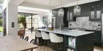
Designing a sophisticated interior requires a careful balance of color, texture, and depth. Homeowners and designers often struggle to find materials that harmonize without competing for attention. By selecting high-quality surface materials, you establish a solid foundation for your design scheme. Incorporating premium finishes like Lucerne Grand into your home can elevate any room from ordinary to extraordinary. When you pair this striking material with the right companion finishes, the results are stunning. For instance, blending it with Thomson Reserve creates a balanced, sophisticated aesthetic that works beautifully in both modern and traditional spaces. This guide offers practical tips to help you build a cohesive palette using these two exceptional materials.
Understanding the Visual Profile of Lucerne Grand
Before mixing materials, you must understand the individual characteristics that make each one unique. The deep, rich tones of Lucerne Grand serve as an excellent anchor for high-traffic areas and focal points alike. This material features subtle veining and a complex color profile that shifts slightly depending on the lighting in the room. In bright, natural daylight, the intricate patterns stand out, revealing cool undertones that suggest quiet luxury. Under warm evening lights, the surface takes on a softer, more inviting appearance.
Establishing a Focal Point
Because of its strong visual presence, you should use this material in areas where you want to draw the eye immediately. Kitchen islands, fireplace surrounds, and bathroom vanity tops are perfect locations. To prevent the space from feeling too heavy, balance this dominant surface with lighter cabinetry or neutral wall paint. Soft off-whites, gentle grays, and muted taupes work best to complement the dark, sophisticated base. By keeping the surrounding elements relatively simple, you allow the natural beauty of the primary material to shine without overwhelming the senses. This strategic placement ensures your design feels intentional, structured, and carefully curated.
Integrating the Warmth of Thomson Reserve
While a dark, dramatic surface creates an immediate impact, every room needs a counterweight to soften the overall look. This is where a complementary material becomes essential. The earthy undertones of Thomson Reserve provide the perfect contrast, offering warmth and organic texture to the design scheme. This material features gentle, flowing patterns and warm, sandy hues that mimic the natural beauty of sun-drenched stone. It brings a sense of comfort and approachability to spaces that might otherwise feel too sterile or cold.
Balancing Warm and Cool Tones
Successful interior design relies on a careful mix of warm and cool elements. When you place a cool-toned surface next to a warm one, you create visual tension that makes the room feel dynamic and alive. Use this secondary material on perimeter countertops, accent walls, or floor tiling to frame the more dramatic focal points. The soft beige and cream tones within the stone reflect light beautifully, brightening up darker corners of the room. This interaction between light and shadow adds physical depth to your living spaces. By using this material to bridge the gap between light walls and dark fixtures, you establish a smooth, natural transition that feels incredibly cohesive.
Perfecting the Transition with Accent Colors
Once you have established your primary and secondary surfaces, the next step is choosing accent colors that tie the palette together. A common mistake is introducing too many competing colors, which clutters the visual field. Instead, select a tight palette of three to four supporting shades. Pairing Lucerne Grand with metallic accents is an excellent way to highlight its cool, deep tones. Brushed brass, champagne gold, and matte black hardware work exceptionally well against its polished surface, adding a touch of modern elegance.
Selecting Complementary Textiles
For textiles and paint, look to the natural variations found within both stone surfaces. Choose linen drapery, wool rugs, and leather upholstery that echo the warm, sandy shades of the secondary stone. Forest green, deep navy, and charcoal gray serve as excellent accent colors for pillows, artwork, and decorative accessories. These rich, saturated colors draw out the subtle veining in the dark surfaces while contrasting beautifully with the lighter elements. Remember to distribute these accent colors evenly throughout the space. If you place all your dark accents on one side of the room, the space will feel lopsided. Spreading the colors evenly ensures a balanced, harmonious environment.
Practical Layout and Placement Strategies
The physical placement of your materials is just as important as the colors themselves. To create a cohesive flow, you must consider how the eye moves through the room. In a kitchen layout, use the dominant material on a central island to make it the undisputed star of the show. Then, apply the lighter stone to the surrounding countertops and backsplash. This arrangement prevents the kitchen from feeling cramped or dark, as the lighter perimeter surfaces bounce light back into the workspace.
Creating Continuity Across Rooms
You can also apply this dual-material strategy in open-concept living areas to define different functional zones. For example, use the dark stone for a wet bar countertop in the dining area, and use the lighter stone for the fireplace hearth in the adjacent living room. Seeing how Thomson Reserve anchors the lighter elements in one area while complementing the dark stone in another creates a sense of architectural continuity. This repetition of materials makes the entire home feel like a single, unified space rather than a collection of disconnected rooms. Ensure that you maintain consistent lighting across these zones to preserve the true colors of both materials throughout the day.
Conclusion
Building a cohesive interior palette does not have to be a daunting task. By understanding the unique visual characteristics of your materials, you can create a space that feels both luxurious and comfortable. Combining the dramatic, cool elegance of Lucerne Grand with the warm, inviting texture of Thomson Reserve provides a balanced foundation for any home design. Whether you are planning a complete kitchen remodel or updating a master bathroom, these tips will help you execute your vision with confidence. Focus on balancing light and dark tones, selecting complementary accent colors, and placing your materials strategically to create a beautiful, harmonious home that you will enjoy for many years to come.